Page Tree
Previous Releases
High Performance is a design approach that turns traditional displays into intuitive information visualization with actionable intelligence. It displays information in a simple color style to facilitate the understanding of the project status.
The High Performance approach achieves this by following several fundamental characteristics, which are listed below.
The main objective of this design is to increase the effectiveness of data handling and analysis.
It is a known fact that humans can handle only so much information at a time. According to the ISA SP 18.2 Standard, project operators should only face about 10 alarms per hour in order to accurately respond to each alarm. However, this rate is usually higher in the real world.
Human Centric Design allows users to create smart designs with color configurations that help the operator's eyes easily focus on the situations that require the most attention.
The High Performance HMI Handbook has several proven operator performance results detailed below.
Traditional HMI | High performance HMI | Results | |
Detecting abnormal situations before alarms occur |
1 in 10 occurrences |
5 in 10 occurrences |
5x improvement |
Success rate handling abnormal situations | 70% | 96% | 37% improvement |
Time to complete abnormal situation tasks | 18.1 minutes | 10.6 minutes | 41% improvement |
Even though the HMI application is a visual/ graphic interface, you should not select the colors and shapes simply to have a stylish, good looking display. The focus should be on facilitating project comprehension.
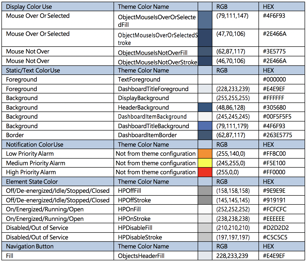
There is a set of color conventions that are recommended for HMI projects. . .
The table below illustrates the recommended color palette for a High Performance HMI Project.
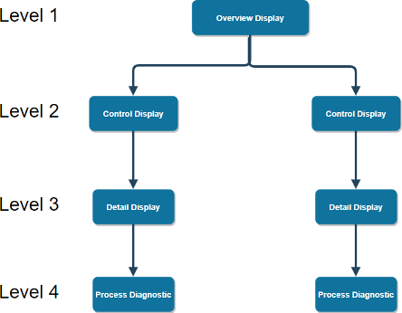
Layered Graphical Hierarchy refers to the way in which data is structured across displays throughout the project. The recommended organization method is using a series of levels and sublevels in which each level is more detailed than the previous one.
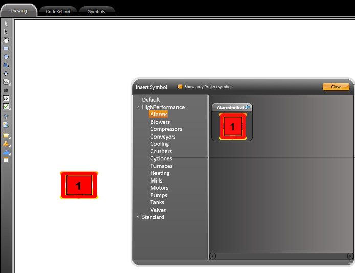
Symbols are graphical objects that contain a series of built-in dynamics which are applied to them. They can be added to a display as a representation of tags.
The HPG are accessed through the Draw Editor under the Symbol Library button (located in the toolbar).
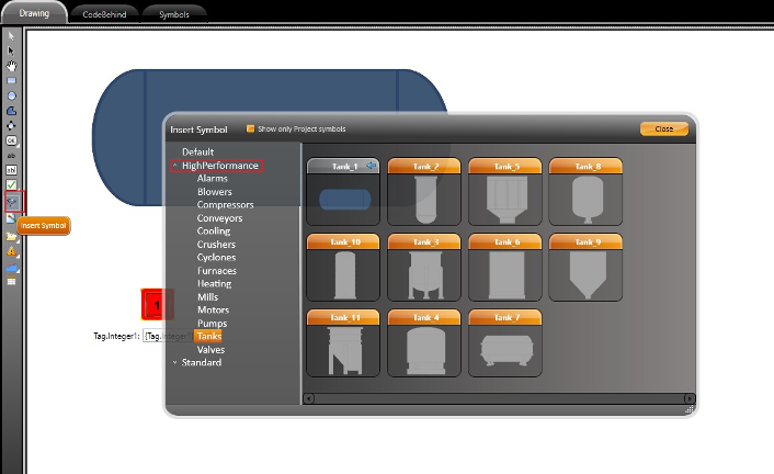
The symbols are separated into 3 main categories (Default, HighPerformance and Standard). Since we are focusing on the HighPerformance one, each subcategory component is detailed below.
Alarms Blowers Compressors Conveyors Cooling | Crushers Cyclones Furnaces Heating Mills | Motors Pumps Tanks Valves |
|---|
To map the added symbol to a runtime object (tag or some other property, double-click on it to display its supported properties.
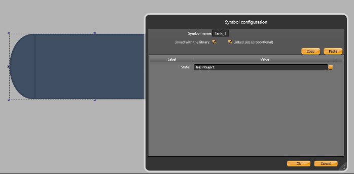
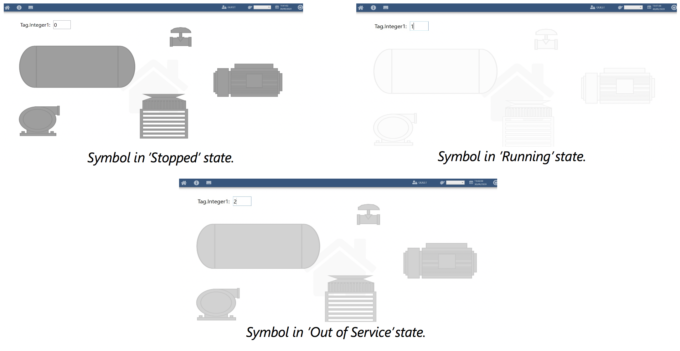
Each symbol has different runtime properties, but they all have a similar behavior in their appearance.
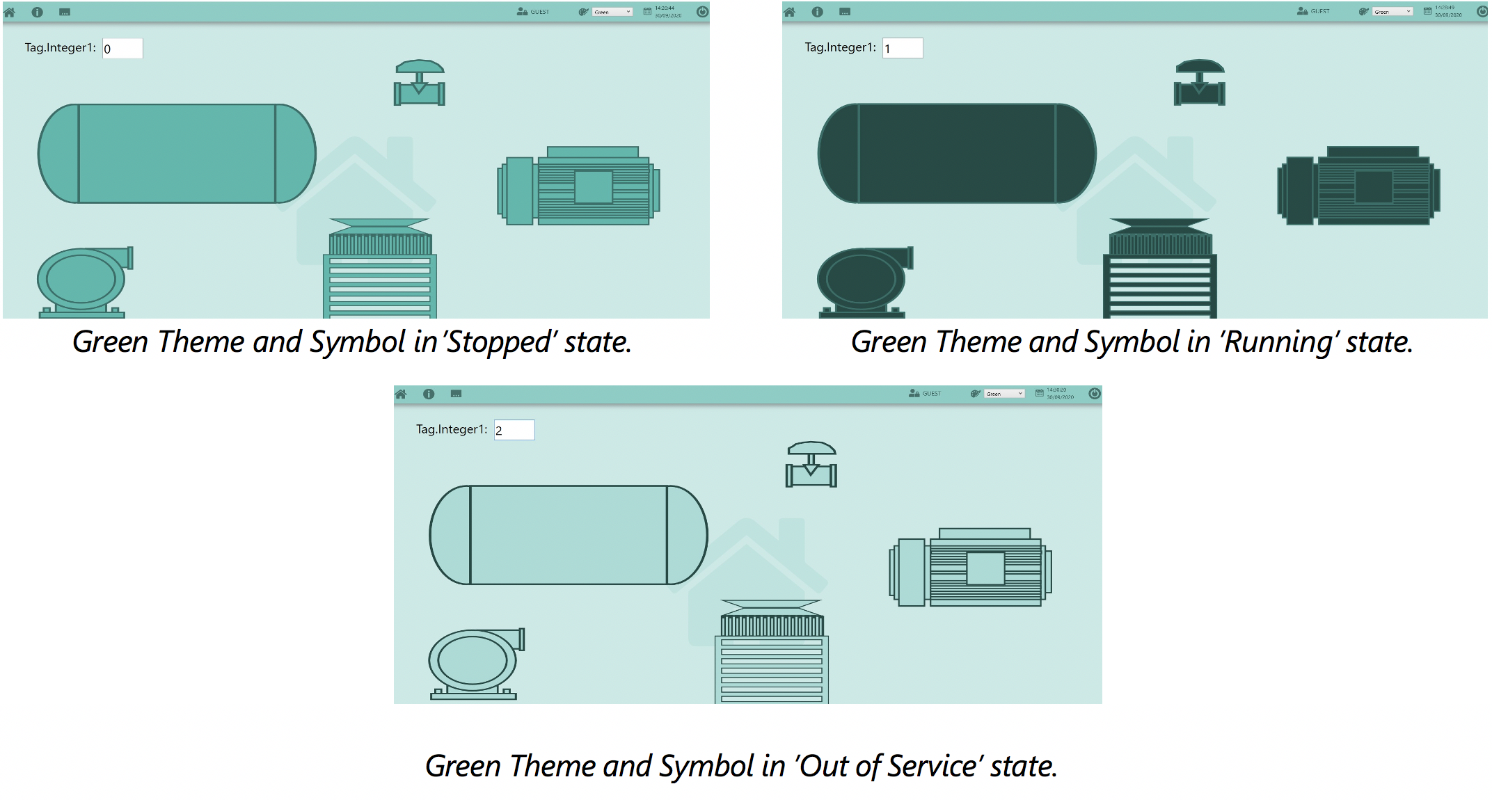
Value = 0 // Off/De-energized/Idle/Stopped/Closed
Value = 1 // On/Energized/Running/Open
Value = 2 // Disabled/Out of Service
These values follow a color convention pattern for HMI displays.
The images below illustrates the different colors a symbol can display.
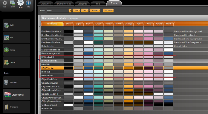
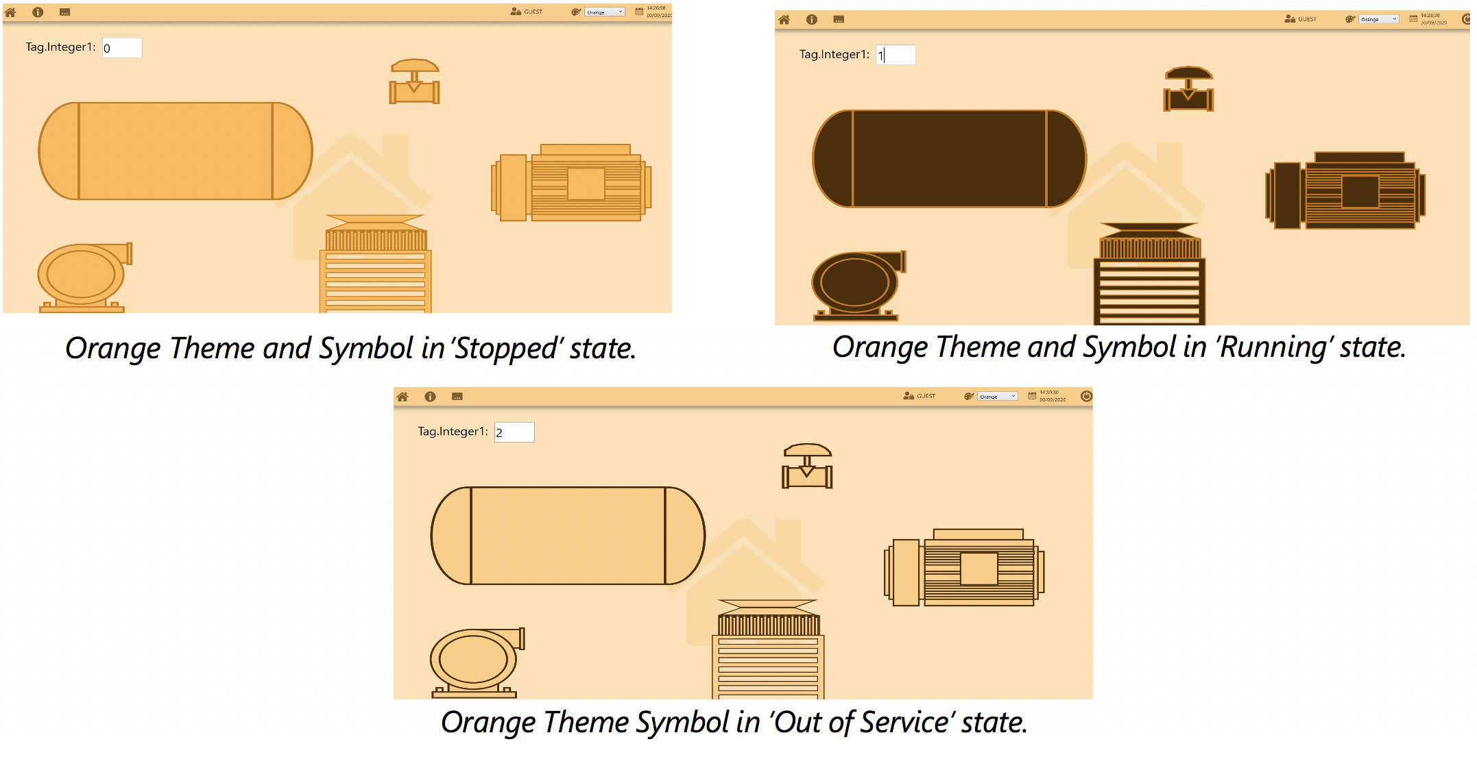
The symbol's appearance can be customized by changing the theme for this object. On Run-Dictionaries-Themes, you will find predefined theme palettes that are built into the NewProject Templates.
The ItemName properties related to HPG Symbols are highlighted in the image below.
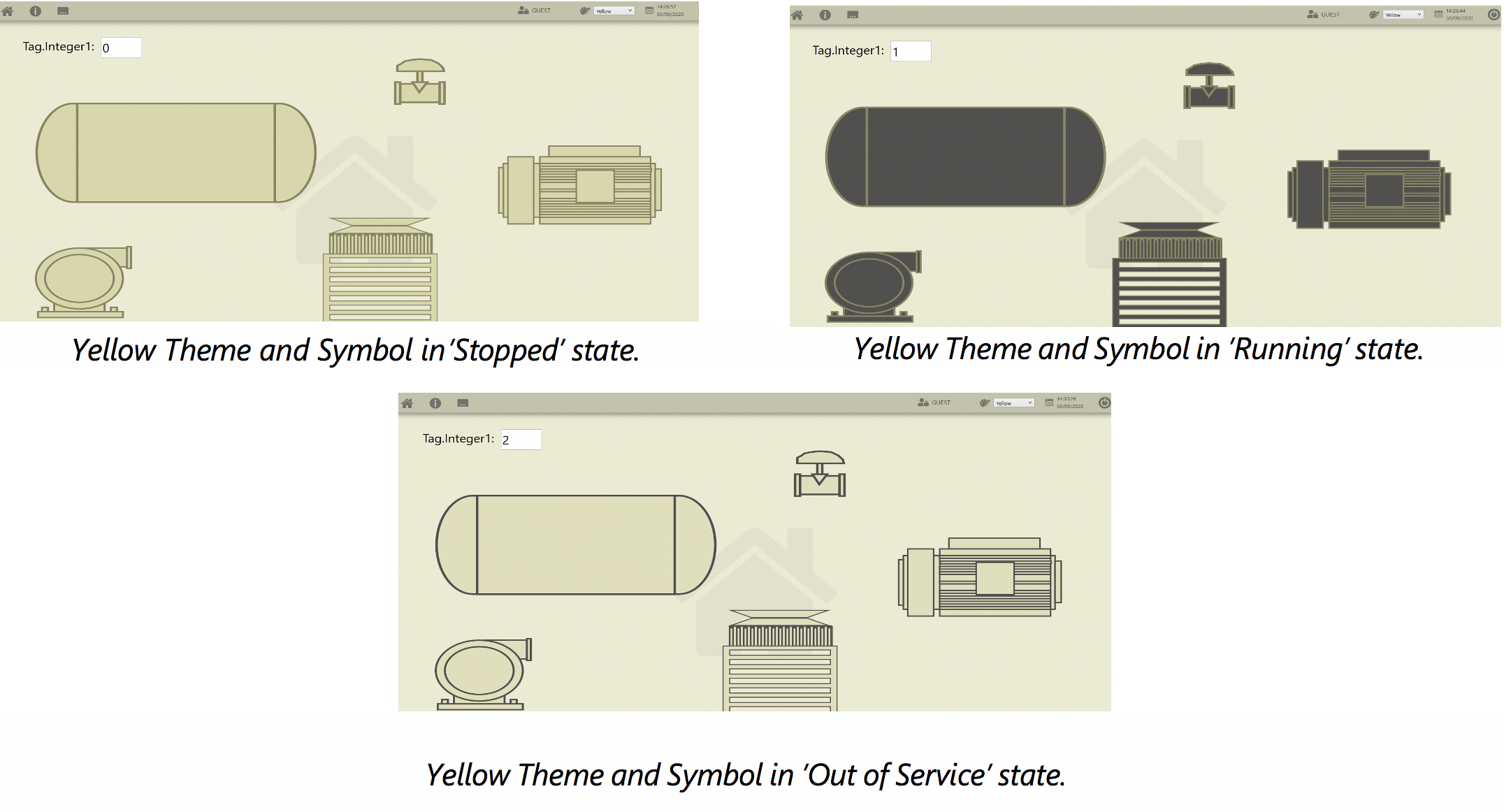
The user can use this page to easily create new themes or edit pre-existing ones. The following images show some examples using different themes.
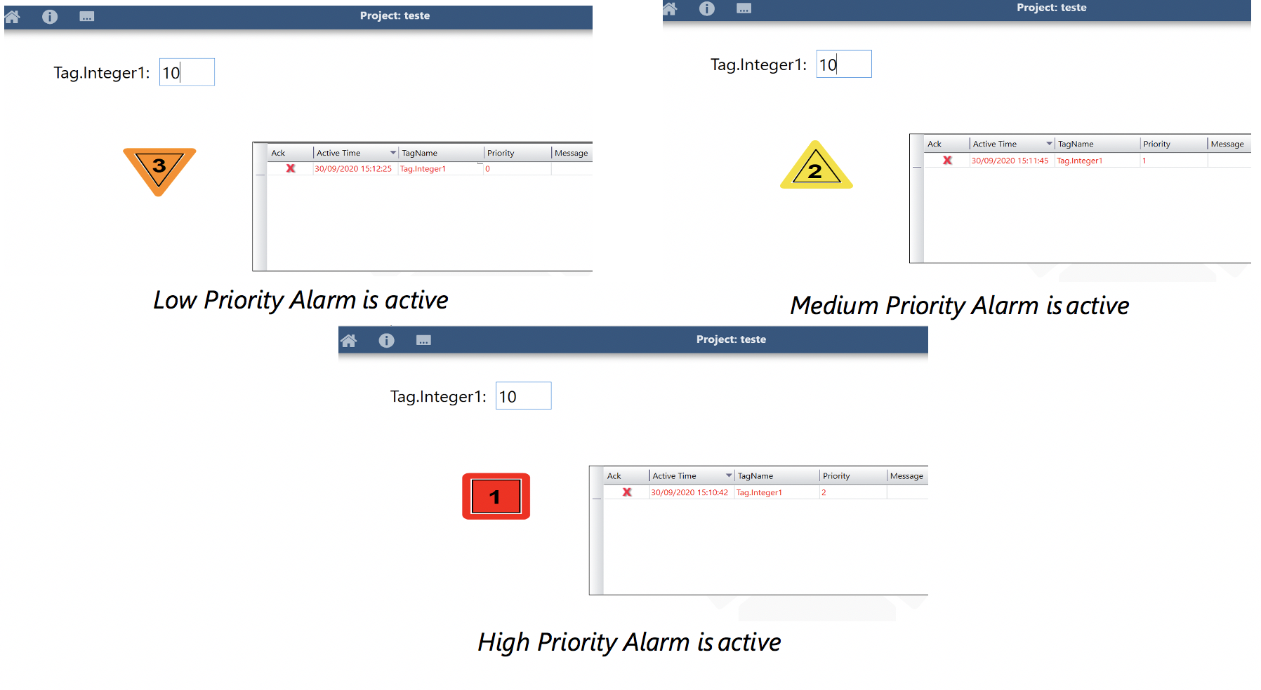
This symbol acts as an indicator for the alarm state of a specific tag. It can display the alarm priority level (low, medium and high), and it has 3 different color configurations according to the Alarm State. See image below.
There is a tag property called AlarmPriorityEnum that is used for animating the Alarm Indicator symbol. The Enum property has the following settings:
Low Priority (Alarm Priority = 0 - value in the Alarm Items table)
1	- Acknowledged
2	- Normalized
3	- Active

Medium Priority (Alarm Priority = 1 - value in the Alarm Items table)
4	- Acknowledged 5- Normalized
6	- Active

High Priority (Alarm Priority = 2 - value in the Alarm Items table)
7	- Acknowledged
8	- Normalized
9	- Active
In Runtime, the Alarm Indicator can display the following behaviors:
Number in Symbol:
-	1: Priority High (2)
-	2: Priority Medium (1)
-	3: Priority Low (0)

Outer Border and inner element:
-	Border static and Element blinking: Alarm is active
-	Border static and Element static: Alarm is acked
-	No Border and Element blinking: Alarm is normalized
-	No Border and No Element: Alarm not active
To illustrate the behaviors described above, the following images demonstrates the display's appearance when an alarm is in active state.