Page Tree
Software Knowledgebases
Displays are the graphic regions or windows that make up the overall layout of the FactoryStudio user interface. Symbols are the individual elements included in a display. The following sections describe how to work with the user interface:
Displays are components of the user interface for your application. A display can have multiple elements in it, including controls, data display areas, static areas that always display and more. Elements of the display can be static, that is, they always display, such as a menu bar, toolbar, or status bar. Displays can also change depending on what the user clicks or selects.
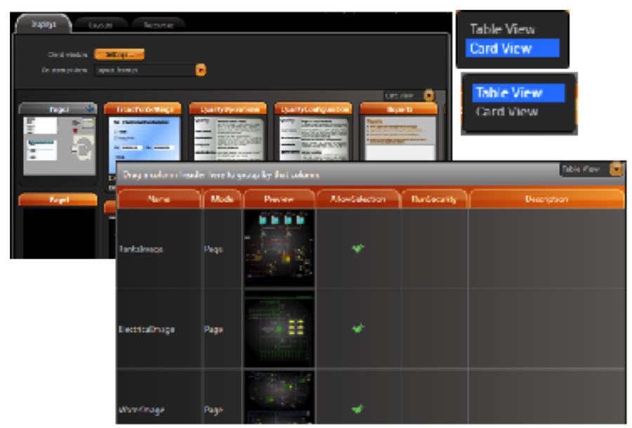
To select displays:
See the list of available displays.
Column | Description |
Name | Read-only. Name of the Display. Configured in Draw. |
ClientType | Read-only. Shows the type of the client, either NET or HTML5. |
Mode | Read-only. Shows whether the display is used as a Page, a Popup, or a Dialog. Configured in Draw. |
Preview | Read-only. Shows a thumbnail of the display. |
AllowSelection | Select to allow users to select the display from the PageSelector. |
Width | Read-only. Display width in WPF units (one WPF unit = 1/96 inch). Configured in Draw |
Height | Read-only. Display height in WPF units. Configured in Draw |
Left | Read-only. Left margin, in WPF units, for Canvas layouts. Configured in Draw |
Top | Read-only. Top margin, in WPF units, for Canvas layouts. Configured in Draw |
Dimension | Read-only. Configured in Draw |
Size | Read-only. Configured in Draw |
EditSecurity | Select which categories of users have access to edit this display. |
RunSecurity | Select which categories of users have access to this display at runtime. |
Description | Enter a description for this display. |
In order to edit a display, select the display and press the  DRAW button.
When you are in the Drawing environment you can also switch displays using the dropdown list on the top toolbar.
To create a new display:
 Close Display and Create New One. (If you do not see this button in the toolbar, make your window wider.) The New Display window displays.
Column | Description |
Display Name | Enter a name for the display. |
Description | Enter a description for the display. |
.NET Smart Client | Select this option if the display is designed to be presented natively on the host platform. |
HTML5 | If you plan to use this display as HTML5 on browsers, select this option when you create the display. You cannot change it later.
|
iPad/iPhone iOS Target | If you plan to use this display for iPad and iPhone users, select this option when you create the display. You cannot change it later.
|
Column | Description |
Mode | Select the type of display you want to create:
|
Background | Select the background color for the display. |
Width | Enter the width of the display, in WPF units (device-independent pixels; one WPF unit = 1/96 inch). Be sure to take into account the size of the layout. |
Height | Enter the width of the display, in WPF units (device-independent pixels; one WPF unit = 1/96 inch). Be sure to take into account the size of the layout. |
Border | Select the type of border. |
CloseButton | Select to display Close button. Available only for Popups and Dialogs. |
Animation | Select the type of animation to use when starting this display. |
Show on PageSelector Object | Select to include this display in the page selector that lets users go directly to a different display in the application. |
iPad/iPhone iOS target | Read-only. Shows whether you selected the iPad/iPhone iOS Target option when you created the display. |
Placement | Select where on the layout you want to place the display. Available only for Popups and Dialogs. |
Target | Select whether the display appears relative to the mouse position or relative to the whole window. Available only for Popups and Dialogs. |
DialogButtons | Select the buttons you want on the dialog. Available only for Dialogs. |
Title | Enter a title that appears at the top the display. |
Title Background | Select a color for the title background. |
Stays Open on Page Change | Leave the popup window open when the user clicks something that opens a different display. Available only for Popups. |
Stays Open After Losing Focus | Leave the popup window open when the user clicks a different display. Available only for Popups. |
Left | Enter how far from the left of the layout the display should appear, in WPF units. Available only for Canvas layouts. |
Top | Enter how far from the top of the layout the display should appear, in WPF units). Available only for Canvas layouts. |
When selecting multiple objects, the last object selected is the "master," whose properties are shown on the left. If you then align the objects, the alignment is based on the master. If you change other properties, the properties are changed for all selected objects.
A layout defines the size of the application window and the basic arrangement of display components in the runtime application. Be sure to plan how you want to use displays. For example, consider whether you want a menu bar, toolbar, or other elements to always display at the top of the application window.
You may need only one layout to handle the information in the application.
The last display listed in the Layout tab is the one that is replaced when you change the display. For example, new projects include a default layout called Startup. The MainPage display that is listed last is the default area that changes when you tell the application to open a display.
To create a layout:
Column | Description |
Layout name | Enter a name for the layout. |
Layout | Select the layout type:
|
Description | Enter a description of this layout. |
Column | Description |
Width | Enter the width, in WPF units (device-independent pixels), of the layout. This is the width of the runtime application. |
Height | Enter the height, in WPF units (device-independent pixels), of the layout. This is the height of the runtime application. |
Background | Set the background color of the layout. This is the background color of the runtime application |
 Add Row to add a row for a display. The displays you add here are the first displays the layout uses.
Enter or select information, as needed.
Column | Description |
Page | Select a display you want to include in the layout. Only page displays are available for use in a layout. |
Docking | Select the docking location for this display:
|
HorizontalAlign | Select the horizontal alignment for this layout:
|
VerticalAlign | Select the vertical alignment for this layout:
|
Margins | Set the margin for this layout. |
Left | Set the left position of the layout |
Top | Set the top position of the layout |
The Drawing tab has the following controls to create, format, and configure displays:
To configure dynamic graphic displays, from the Main Menu, click on the "Draw" icon.
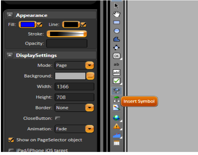
The Appearance parameters dictate the brush style used when drawing objects in the display, including colors. Clicking on the Fill option lets you specify Colors, gradients, or objects with which to fill the graphic.
The DisplaySettings dictate the attributes of the display. Displays can be configured as Pop Ups, Dialogs, or normal page displays.
Like with any graphical object, displays can have varying colors and patterns, borders, titles and more.
One special feature is that you can specify a transition animation to use when entering the display much like you have in PowerPoint presentations.
Vertical toolbar commands |
|
Commands | Description |
|
|
|
|
| Use the Hand Tool to modify the view window by clicking the display background and holding down the left mouse button then shift the display to the desired position. |
Geometric objects tools | Right-click to end use of each tool. |
| Creates a rectangle object. |
| Creates an ellipse object. |
| Creates a polygon object. |
| Creates a polyline object. |
| Creates a button object. |
| Creates a label box. |
| Creates a text output object. |
| Creates a text input/output (I/O) object. |
| Creates a check box object. Right-click this button to access the following tools: |
| The symbol library includes both built-in and user-defined symbols. |
| The Symbol Factory is an external symbol library that contains a lot of symbols precreated to be used on the projects. |
| Insert an image to be used on the entire project. |
| Creates a Web Browser object. Hover over this button to access the following tools: |
| Creates an alarm window. Position the alarm window and double-click to configure the alarm window settings. For more information, see Configuring an Alarm Window below. |
| Creates an Alarm Area control, that allows to view the existing alarm tree. |
| Creates a trend window. Position the trend window and double-click to configure the trend window settings. For more information, see Configuring a Trend Window below. |
| Creates a drilling chart trend window. Position the trend window and double-click to configure the trend window settings. For more information, see Configuring a Trend Window below. |
| Creates a data grid window. Position the data grid window and double-click to configure the data grid window settings. For more information, see Configuring a DataGrid Window below. |
Horizontal toolbar commands |
|
Commands | Description |
| Grid definition |
| Screen Zoom |
| Group |
| Ungroup |
| Union |
| Intersect |
| Exclude |
| Exclusive-Or |
| AlignLeft |
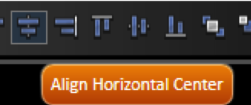
| AlignHorizontalCenter |
| AlignRight |
| AlignTop |
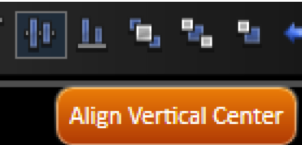
| AlignVerticalCenter |
| AlignBottom |
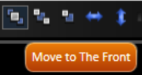
| Move To The Front |
| Move To The Back |
| Change Z-Oder |
| Resize Width |
| Resize Height |
| SpaceEvenlyHorizontal |
| SpaceEvenlyVertical |
| FlipHorizontally |
| Flip Vertically |
| Lock element |
| Unlock element |
| Unlock All Elements |
| Show All Elements |
| Hide Selected Element |
Examples
Here you will see examples showing the functionality of the commands of the horizontal toolbar.
The shapes used can be any object without Dynamics, like polygons, ellipses, rectangles.
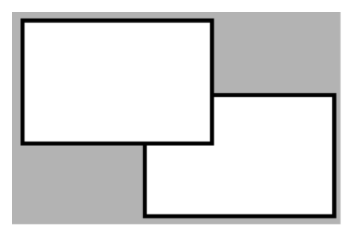
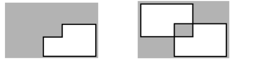
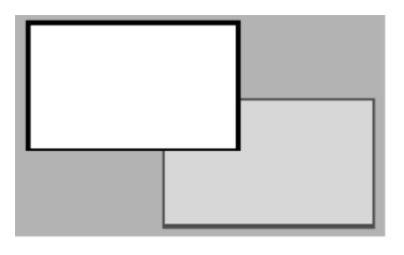
Union  and Intersect
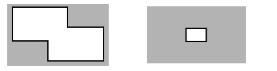
Exclude  and Exclusive-Or
 : Select both rectangles then click to lock. Now the rectangles can not be selected.
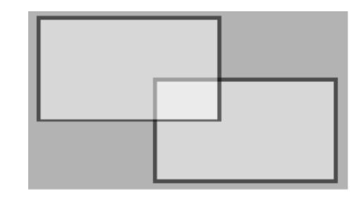
 on the vertical toolbar.
 .
. 
 .
.Dynamics let you configure real-time changes on the object look, position, size, colors, the value the object reflects, user action to take when a user clicks, and more. That dynamic behavior is configured by creating links from the object properties to tags or other project runtime properties.
In some systems, the name "animation" is used to refer to those dynamic runtime changes; in FactoryStudio we elected to use the term "Dynamics" to make a clear distinction with the WPF animations features; WPF animations also refers to changes in the graphics object properties when running the displays, but using timers and other objects status to guide the animation, not the real-time database values.
When you double click on an object, or press the Dynamics button, or select it on the right-click context menu, a list of compatible dynamics that can be applied to the selected object is presented.
Dynamics animations |
|
Setting | Description |
Action | Executes actions and commands triggered by the user interface. |
Shine | Changes the object appearance dynamically. |
TextIO | Text input and text output Dynamic. |
HyperLink | Opens a hyperlink. |
Security | Sets the object runtime permissions to execute actions. |
FillColor | Changes the object fill color dynamically. |
LineColor | Changes the object line color dynamically. |
TextColor | Changes the object text color dynamically. |
Bargraph | Bargraph dynamic. |
Visibility | Changes the object visibility and opacity dynamically. |
MoveDrag | Moves the object dynamically. |
Scale | Changes the object size dynamically. |
Rotate | Rotates the object dynamically. |
Skew | Skews the object dynamically. |
TextOutput | Text output dynamic. |
Get, Apply, and Replace
After associating a dynamic with an object you can use the buttons Get and Apply to move dynamics settings configuration from one object to another. Select the object with the dynamics you want to use, and press Get. You can right click the dynamic name at the left panel, in order to enable or disable the ones that will be applied. Select one or more target objects and press Apply.
You can use the Replace button to change the Tags in the dynamics on the selected objects. The String button is used to change all strings at the selected objects.
Settings
The tables below present the detailed settings available for each type of dynamic.
Action Dynamic configuration |
|
Setting | Description |
Action | Executes an action triggered by the user interface:. |
Event | Choose one of the Mouse events. More than one event can be selected for each action. For example, you can set one action for MouseLeftButtonDown and another action for MouseLeftButtonUp. |
Action | Select an action for the given event:
|
Examples
Run Expressions Examples:
Expression—Tag.quantity1 + Tag.quantity2.
Result—Tag.totalQuantity.
Expression—tagCounter + 1.
Result—tagCounter.
Expression—If(tagCounter < 10,tagCounter + 1,0).
Result:—tagCounter.
For more information, see "Configuring Expressions" on page 118.
Shine Dynamic
Shine Dynamic configuration |
|
Setting | Description |
Shine | Changes the object appearance dynamically. |
IsMouseOver | Enter a tag that will receive the OverValue or the NotOverValue. |
OverValue | The IsMouseOver value when the mouse is over the object. |
NotOverValue | The IsMouseOver value when the mouse is not over the object. |
Mouse Over Appearance | The object appearance when the mouse is over it.
|
Mouse Not Over Appearance | The object appearance when the mouse is Not over it:
|
Is Selected Appearance | The object appearance when it is selected:
|
Scale Reference |
|
ShowUid | Set to show the Uid of the object on hover |
Tooltip | Set to show as a tooltip on hover |
Text I/O dynamic
Text I/O Dynamic configuration |
|
Setting | Description |
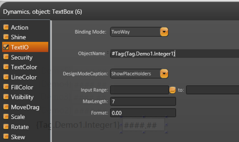
TextIO | Text input and text output Dynamic. If text is a tag value or a property, it must be between curly brackets. For example: {Tag.analogInt1} |
Binding Mode | Associate an object with a tag:
|
Object or Expression | Object (input) or Expression (output only) connected with the Text Box. |
DesignModeCaption | The value shown in design mode:
|
Input Range | Defines the numeric range for the entered value. |
MaxLength | Defines the maximum number of characters. |
Format | Defines the text format for the field |
Hyperlink and Security dynamic
Hyperlink Dynamic configuration |
|
Setting | Description |
HyperLink | Opens a hyperlink. |
HyperLinkType | Select the hyperlink type:
|
Url | Set the URL to open. |
Security Dynamic configuration |
|
Setting | Description |
Security | Set the object runtime permissions. |
Disable | Enter a tag, a property, or an expression returning a value. If the resulting value is:
|
Verify Permissions | When selected, only the chosen permission groups can access the object. |
Confirm Message | Shows a confirmation dialog before taking some action:
|
ESign Required | Set if the Esign is required |
Fill, Line and Text Color Dynamic
Fill, Line and Text Color Dynamic configuration |
|
Setting | Description |
FillColor | Changes the object fill color dynamically. |
Expression | the value used for the FillColor dynamic. |
Change Color |
|
Bad Quality | Select color when the related tag quality is bad |
Undefined Quality | Select color when the related tag quality is undefined |
LineColor | Changes the object line color dynamically:. |
Expression | the value used for the LineColor dynamic. |
Change Color |
|
TextColor | Changes the object text color dynamically:. |
Expression | the value used for the TextColor dynamic. |
Change Color |
|
Bargraph Dynamic
Bargraph Dynamic configuration |
|
Setting | Description |
Bargraph | Bargraph dynamic. |
Expression | the value used for the bargraph dynamic. |
Value Range | The minimum and maximum values that will correspond to the minimum and maximum fill percentage. |
Fill (%) | The minimum and maximum bargraph fill percentage. |
Bar Color | The bar graph color. |
Orientation | The bar graph orientation: |
Visibility Dynamic
Visibility Dynamic configuration |
|
Setting | Description |
Visibility | Changes the object visibility and opacity dynamically. |
Visible | Enter a tag, a property, or an expression returning a value. If the resulting value is:
|
Hide when security is enabled | Hides the component when security is enabled for the current user |
Opacity |
|
MoveDrag Dynamics
MoveDrag Dynamic configuration |
|
Setting | Description |
MoveDrag | Moves the object dynamically. |
BindingMode |
|
Horizontal Move |
|
Vertical Move |
|
Use previous object for position reference | Reference the current object position based on the directly previous object |
Scale Dynamic
Scale Dynamic configuration |
|
Setting | Description |
Scale | Changes the object size dynamically. |
Width Scale |
|
Height Scale |
|
Scale Reference: |
|
Rotate Dynamic
Rotate Dynamic configuration |
|
Setting | Description |
Rotate | Rotates the object dynamically. |
Expression | the value used for the rotation. |
Value Range | The minimum and maximum values that will correspond to the minimum and maximum angle. For example: 0 to 100 |
Angle | The minimum and maximum rotation angle. For example: 0 to 360 |
RPM | Number of rotations per minute, that value can be defined on Expression. |
Center Reference | Clockwise – Check if you want Clockwise. |
ON/OFF | Enter with the object property that will turn ON/OFF the Rotation Dynamic |
Skew Dynamic
Skew Dynamic configuration |
|
Setting | Description |
Skew | Skews the object dynamically. |
X-axis Skew |
|
Y axis skew |
|
Skew Reference |
|
TextOutput Dynamic
Table 15: TextOuput Dynamic configuration |
|
Setting | Description |
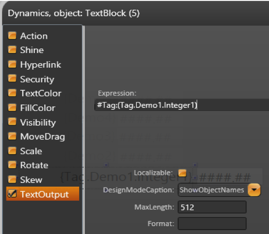
TextOutput | Text output dynamic. |
Expression | Indicates the text that will be shown in the object. |
Localizable | Indicates whether the text must be translated when the dictionary changes. |
DesignModeCaption |
|
MaxLength | Defines the maximum number of characters. |
Format | Specify the format of the field |
This section discusses how to configure various types of displays that present data.
Configuring a Circular Panel
Double-click any Circular Panel object in the display, or use the left panel PieChart to configure it.
Circular Panel configuration |
|
Field | Description |
Control Name | Defines a name for the control, so it can be accessed in the CodeBehind script. See Displays Code Behind. |
Selected Value | Select an object to represent the selected value |
SelectedIndex | Select an object to represent the selected index |
ImageSize | Size of the selected image |
FontSize | Size of the font used on the component |
Columns | For each value that you want to include, select a section and configure the settings to the right of the list (described below). The panel displays a section for each column. |
FieldName | Name of the field to be used |
Title | Name to be shown on the component |
Image | Select a resource image to display. |
Preview | Read-only display of selected image. |
Configuring a PieChart
Double-click any PieChart object in the display to configure it.
Pie Chart configuration |
|
Field | Description |
Control Name | Defines a name for the control, so it can be accessed in the CodeBehind script. See Displays Code Behind |
ChartType | Select the type of chart: Percent, Angles, or Section |
Data Items | For each value that you want to include, select a section and configure the settings to the right of the list (described below). The chart displays a section for each data item. |
FieldName | Enter a name for the data item. |
LinkedValue | Enter a tag name as the data source for the data item. |
Brush | Click to select the color for the data item. |
Configuring a BarChart
Double-click any BarChart object in the display to configure it.
Bar Chart configuration |
|
Field | Description |
Control Name | Defines a name for the control, so it can be accessed in the CodeBehind script. See "Displays Code Behind" on page 129. |
Type | Select the type of chart. |
Data Source | Enter the dataset table or query to use for the chart. |
Grid Lines | Click to select the color for the grid lines. |
Window | Click to select the color for the window background. |
Labels | Click to select the color for the labels. |
Show Horizontal Labels 45° | Select to angle the labels below each bar at 45°. |
Show value over bar | Select to display the bar value above the bar. |
Hide all Zero Series | Set the series that has values 0 to be hidden |
Show value labels 90° | Select to show the labels on each bar at 90°. |
Y Axis Range | Set the range of the Y axis (from and to) |
Y Axis Height | Set the Height of the Y axis |
Y Axis Labels | Set the quantity of the labels to show on Y axis |
Auto Scale Y Axis | Set to make the Y axis auto scalable |
Format | Set the format of the Y axis values |
Data Items | For each column in the data source that you want to include, select a bar and configure the settings to the right of the list (described below). The chart displays a bar for each row. |
FieldTitle | Title to be show in the display to the current column |
FieldValue | Name of the column in the database. |
Min. | Enter a tag to define the minimum value. |
Max. | Enter a tag to define the maximum value. |
Brush | Click to select the color for the data item. |
Configuring an Alarm Window
Double-click any Alarm window object in the display to configure it.
Alarm window configuration |
|
Field | Description |
Control Name | Defines a name for the control, so it can be accessed in the CodeBehind script. See Displays Code Behind. |
MaxLines | Maximum number of lines to display in the window. |
List | Select the type of alarms to display in the window:
|
Merge Hi and HiHi Lines | Combines alarms configured as Hi and HiHi into a single row. |
History Interval/To | Enter the start and end dates for the alarms. |
Show Column Titles | Select to display the column titles. |
Ack by Page | Enter a tag name, which when triggered, acknowledges the alarms in the alarm window. |
Show Header | Enter text to display above the column titles. |
AllowSort | Select to let users sort the data by column. |
Allow Column Reorder | Select to let users change the order of the columns. |
Display value column as string | Set the format of the value column to string |
Filter | Enter SQL statement to limit the alarms displayed. |
Display Millisecond | Select to include milliseconds in the alarm time. |
Ack Selected Line | Configure settings for acknowledging an alarm. |
Columns | For each column in the list, select the column and configure the settings to the right of the list (described below). |
Visible | Select for column to display in the alarm window. |
Allow Filter | Select to let users filter the column. |
Show in Column Chooser | Select to include the column in the column chooser, which lets users select the columns to display. |
Title | Enter the text for the column title. |
Width | Enter the initial column width, in WPF units (device-independent pixels). |
Sort | Select how to initially sort the column. |
Configuring the Trend Window
The drawing tool has two trend objects, the TrendChart and the TrendChartLegacy. The TrendChart is the newest that should be used by default, the other was kept to ensure compatibility with projects created in previous release, the iOS displays are using the previous object.
Double-click any Trend window object in the display to configure it.
Trend window settings |
|
Field | Description |
Control Name | Defines a name for the control, so it can be accessed in the CodeBehind script. See Displays Code Behind. |
Bind to Tag | Enter with an object property where the Trend configuration will be saved. |
Bind Pens to Tag | Enter with an object property where the Pen values will be saved. |
Orientation |
|
Window | Set the trend control background color. |
Labels | Set the color of the trend control labels. |
Grid Lines | Set the color of the Grid lines |
Grid Lines Stroke | Set the Grid line settings. |
Cursor | Enables (selected) or disables (deselected) the cursor settings. |
Y Axis |
|
X Axis |
|
Legend | Defines the position of the legends in the Trend Window.
|
Pens |
|
Tag | Set tag that will provide the value for the pen. |
Pen Settings | Set the configuration of the Line color, Line stroke, Fill area and the type of Marker. |
MinValue | Linear scale reference for the tag value, according to the Y-axis range. |
MaxValue | Linear scale reference for the tag value, according to the Y-axis range. |
Auto | Set the value to auto, instead use MinValue and MaxValue |
SPCEnable | Enable or disable the SPC settings. |
SPCSettings | Click to open the SPC settings. |
Show Value Area | Fill the pen area with the specified color |
PenLabel | Set the pen name. |
Filter level | An integer number that "group" points on XY axis, calculating the average between then. |
LimitMinMaxValue | Remove the points less than Tag.Min and greater than Tag.Max. |
Square | Fill the pen points with a square wave. |
Double-click any Trend window legacy object in the display to configure it.
Trend window legacy settings |
|
Field | Description |
Control Name | Defines a name for the control, so it can be accessed in the CodeBehind script. See Displays Code Behind. |
0(online) 1(history) | 0 - the control shows the online data. |
OnlineTrigger | The refresh rate of the online trend control. For example, 00:00:01 or {Tag.trendTimeSpan}. |
Time Before Now |
|
HistoryDateTime | The initial point for the history trend control. For example, {Tag.initialTrendHistory}. |
Grid Line | Set the color of the Grid lines |
Window | Set the trend control background color. |
Labels | Set the color of the trend control labels. |
Off line Marker | Set the marker when the trend is in off line mode |
Cursor Enable | Enables (selected) or disables (deselected) the vertical cursor. |
Pens Legend | Defines the position of the pens legend in the trend control. |
Y Axis |
|
Range | Defines the minimum and maximum values for the Y-axis. |
Labels | Defines the quantity of horizontal grid lines. |
Format | The format of the values in the Y-axis. For valid numeric formats, see Tag Formats. For example, N1 (number with 1 decimal place). |
X Axis |
|
Interval | Defines the X-axis time span. |
Labels | Defines the quantity of horizontal grid lines. |
Format | The X-axis format is defined by two fields: first line format and second line format. This is especially useful to define label marks that require two lines of information. For valid date and time formats, see Tag Formats. For example, T (Time) for the first line format, d (short date) for the second line format. |
Pens |
|
Visible | Shows (1) or hides (0) the selected pen. Ex 1 or {showPen1}. |
Tag | Set tag that will provide the value for the pen. |
Min | Linear scale reference for the tag value, according to the Y-axis range. |
Max | Linear scale reference for the tag value, according to the Y-axis range. |
Pen | Choose the style, the color, and the thickness of the pen line. |
CursorValue | Set the tag that will receive the real value of the Y-axis, according to the cursor position. For example: Tag.pen1CursorValue. |
FieldName | Set the pen name. |
SPC | Check to enable SPC |
MouseActions | Check to enable mouse actions on trend |
Tooltips | Check to enable tool tip on hover |
Allow edit pens/labels | Check to enable allow the pens and labels to be edited |
Y scale for each pen | Y scale for each pen based on min and max of each pen. |
Merge same Y scale | Check to merge the similar Y scales. |
Using Y Axis Scaling
Considering:
Y-axis Min = 0;
Y-axis Max = 100;
The trend control allows many pens to be displayed together. When your pens do not have the same range, you can use the tips below to fit your data in the same chart, for better visualization:
Configuring a DataGrid Window
Double-click any DataGrid window object in the display to configure it.
Data Grid window configuration |
|
Field | Description |
Control Name | Defines a name for the control, so it can be accessed in the code-behind script. See Displays Code Behind |
Data Source | Enter the dataset table or query to use for the window. |
SelectedValues | Enter a string tag or array tag to receive the contents of the selected row. |
SelectedIndex | Enter a tag to receive the number of the currently selected row. Row numbering starts with 0. |
LinesCount | Select a tag to receive the number of lines in the window. |
Pause | Set an object to defines if the datagrid will be updated or not when the data changes. |
Theme | Select the theme for the window. |
BindindMode | Select the binding mode to use. See http://msdn.microsoft.com/en-us/library/system.windows.data.bindingmode.aspx. |
AllowInsert | Select to let users add rows. |
Column Titles | Select to display column titles. |
Transpose | Select to transpose columns to rows |
OneClick Edit | Select to edit cells on first click |
Allow Delete | Select to allow delete data from grid |
AllowSort | Select to let users sort the data by column. |
Auto Column |
|
Multiple Selection | Check to make multiple selection possible |
Edit SelectedValues | Check to make it possible to edit multiple selected values |
Show Header | Check to show headers on grid |
Filter | Enter SQL statement to limit the data displayed. |
Columns | For each column you want to customize or include manually, add the column and configure the settings to the right of the list (described below). |
Visible | Select to allow the column to display in the data grid window. |
Editable | Select to let users edit the column. |
Show in Column Chooser | Select to include the column in the column chooser, which lets users select the columns to display. |
FieldName | Enter a name for the column. |
Editor | Select the column data type. |
Title | Enter the text for the column header. |
Width | Enter the initial column width, in WPF units (device-independent pixels; one WPF = 1/96 inch). |
Sort | Select how to initially sort the column. |
FactoryStudio has great features to improve the productivity on creating graphical displays to your application. The drawing tools allows you to easily manage symbols, image files, import objects from a 5000 objects gallery, create your own symbols with dynamic properties, and map tags and templates to its default graphical user interface.
There are three main repositories for reusable components, the Images, the Symbol Factory library, and the Local Symbols Gallery. Let's explore each one.
Images: Used to insert an external image file from your computer into the project configuration, like an icon, wallpaper, object, or background image. You can manage the imported images at Edit > Displays > Resources. After the image is imported, you no longer need the original file. Images can be used as color brushes for any drawing object, and they can even be used as "color" or the ColorFill dynamic attributes.
Symbol Factory: This is an extensive library of elements, with more than 5000 symbols, all using vector graphics, that you can use for creating your displays or use as a template to create your own custom symbols. Those objects can be applied statically, just as an image or icon, or you can add Dynamics and save them to the Local Symbols library.
Local Symbols: These are the most frequently used symbols. They include the symbols you create in the scope of a project. The symbols in this library can be kept synchronized with the library, in this way, when you change a symbol in this library, the change will be automatically applied to all displays using that symbol. Local Symbols also can have dynamics properties that you can easily map to tags in displays; they can also be defined to be the default graphical representation of tags.
Image Resources
You can import any image file at the Edit > Displays > Resources tab. This creates a repository of images for the application that is stored inside the project database file, so you don't need the original files anymore. These images can be used to be the fill of an object, such as rectangles, ellipses, LabelBoxes, paths, page background, or target color in runtime dynamics using colors.
If you need to update an image with a new version, you can replace it, and it will be updated throughout the application. Be sure to keep the resource name the same.
You can use any image file to fill or "paint" an object when creating displays from Draw > Drawing.
You can import the following file types:
To manage resources:
Column | Description |
Name | Edit the default name. |
Description | Enter a description of this image. |
Folder | Specify the folder where the resource is |
ResourceType | Specify the type of the resource |
Dimension | Read-only. Show the dimension of the resource file |
Size | Read-only. Show the size of the resource file |
Adding an image to a display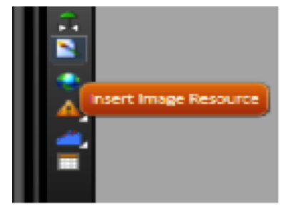
Typically you should use UNIFORM or FILL for image stretching. The image (using the Appearance menu at the left, can be applied to any graphical shape at the display)
The Symbol Factory
The symbols from the Symbol Factory are efficient and well designed vector graphics images. If you need an object like a pump, valve or others in your applications, just open the library and browse for the element or search by name. The difference between the symbols from the Symbol Factory and Local Symbols is that symbols from the Symbol Factory, once included in a display, become part of that display, and have no further connection with the library. In contrast, Local
Symbols can keep an active link with the library, and can also have dynamic properties.
Adding color change animation to Symbol Factory elements
If you want to insert a color change animation, without changing anything on the symbol, you can copy the symbol and overlay a transparent image on top of your image.
For example, suppose we have two pumps. To insert a simple animation that shows when the pump is ON or OFF follow these steps:

 on the horizontal toolbar.
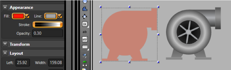
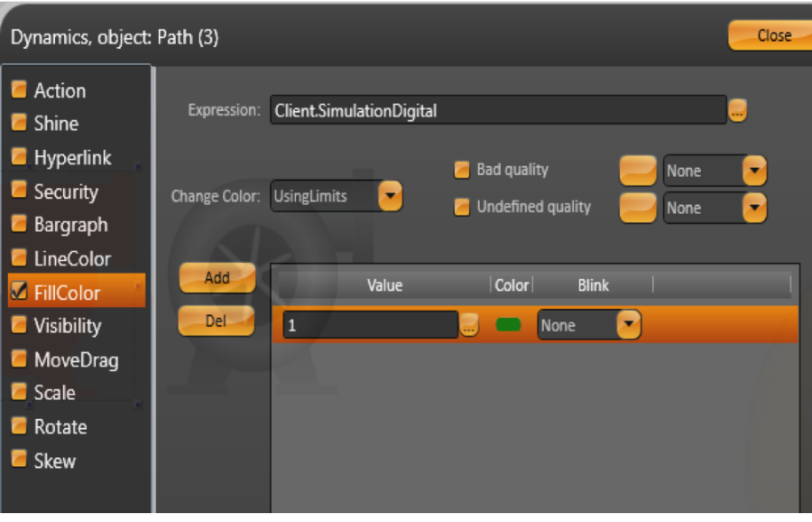
Use the Client.SimulationDigital to simulate a controller changing between 0 and 1.
If you want to control the value yourself, use Client.DigitalValue or Client.NumericValue
 on the top toolbar to see the new pump's animation.
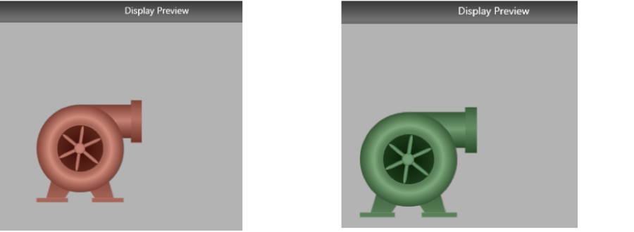
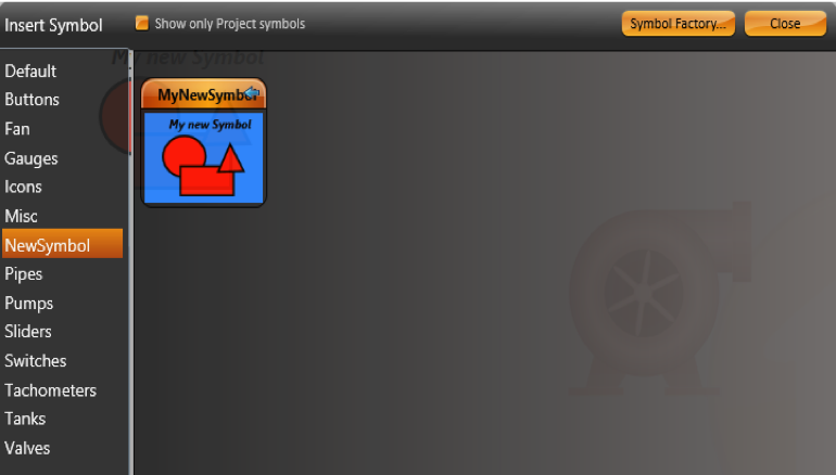
Local symbols
The Local symbols library includes the most frequently used graphics. You can also create symbols and add them to the project local library. Symbols can just be a static image or they can have dynamic properties and tags links.
To view the symbols used by your project, do one of the following:
Creating new Symbols
You can use the drawing tools and the COMBINE commands at the horizontal toolbar to draw your own symbols.
You can also bring symbols from Symbol Factory and click at the UNGROUP command at the horizontal toolbar to edit the imported symbols.
You can also use the "Direct Selection" cursor to edit internal elements without needing to ungroup.
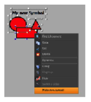
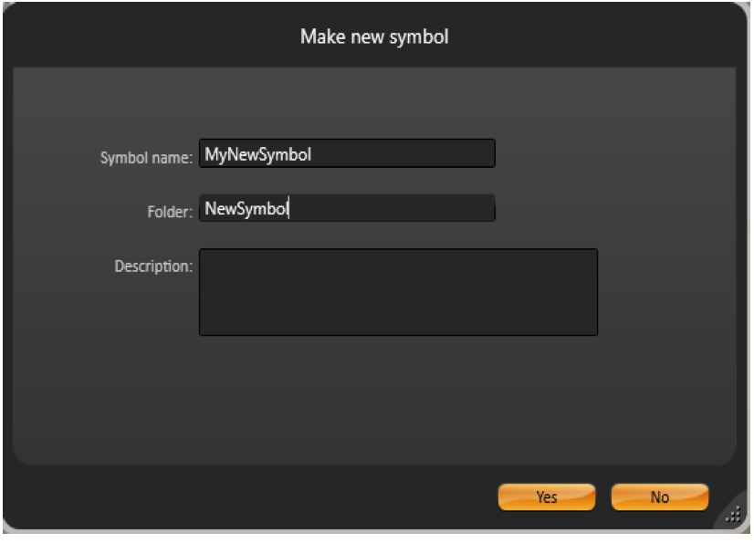
If you want to save the new symbol to the Local Symbols Library, just select the object or objects that you want to be part of the symbol, then right-click and select "Make a new symbol".
The components in the Local Symbol library may have built-in dynamic properties and an easy way to map them to realtime tags in your application. This is explained in the following section.
If you have dynamic properties and tags being used in that symbol, the system will automatically create the symbol label parameters. After making the new symbol, double click it to verify its configuration parameters.
In order to Edit a symbol that is already in the Local Symbol library, insert the symbol in a display, right click on the symbol, and select "Edit Symbol", that will change the drawing tool, locking the other elements in the page, so you change the symbol. When you finish, right-click at any position to select Save to Library, Save Only to Local display, or Cancel your editing.
The objects from "Local Symbols" are composed of some default symbols from the file SymbolLibrary.tproj, added with the product installation, and the symbols you created for your specific project. If you change, delete or insert a symbol in the SymbolLibrary.Tproj, it will be accessible to all projects in that computer. The symbols you are using in your project are saved inside the PROJECT file; therefore they are completely independent of any external file.
Inserting a Local Symbol
Some symbols do not have custom parameters. In this case, the double click will show the Dynamics dialog.
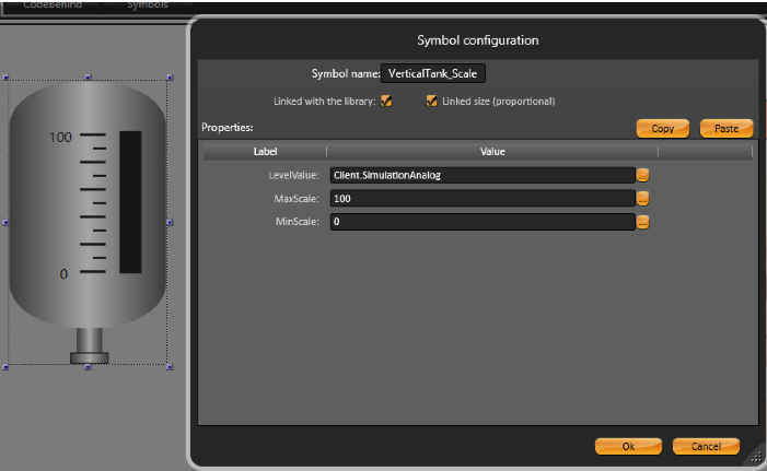
Symbol Parameters
When you insert a symbol from the Symbol Library it may some parameters, like in the example the VerticalTank symbol has the parameters LevelValue, MaxScale and MinScale. To change the linked tags to those parameters, just edit the new tag names in the dialog.
Editing and modifying symbols
Right-click on the VerticalTank symbol and select Edit Symbol. Now you enter in the Edit mode, you can see all objects that are part of the Vertical Tank.
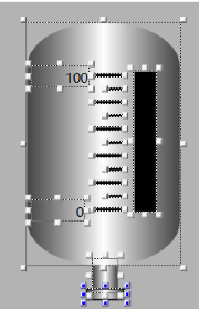
Click on the Black rectangle to see its Dynamics.
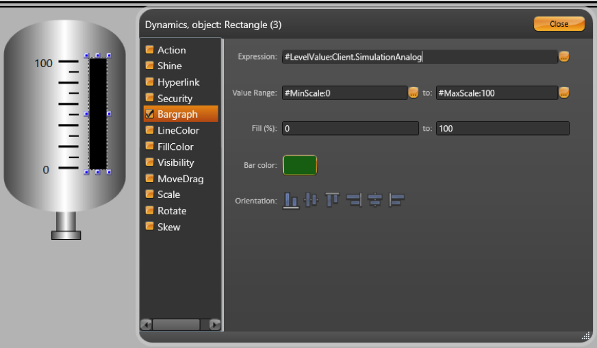
As you see we use #<PropertyName>:TagName
That syntax will create exposed label parameters for the symbol, making it easier to map the linked tags when using the symbol. In this examples, the symbol has the labels "Level","MinScale" and "MaxScale". When you insert this symbol, you will be able to set values for those parameters. After the ":" character, you have the default value.
Example
"#LevelValue:Client.SimulationAnalog", we are creating a property called "LevelValue" which has "Client.SimulationAnalog" as the default value.
You can use any name for the Label parameter.
When creating symbols, it is useful to initially map the properties to client.SimulationDigital, Client.SimulationAnalog or Client.SimulationDouble, which are variables with values changing every second so you can see the result of your dynamic properties. You can use the internal variables Client.DigitalValue, Client.NumericValue and Client.TextValue, when you just want to put a placeholder value, with no built-in simulation.
In order to save the symbol, right-click on the symbol or on the display and press Save to Symbol Library, or click the Save icon on the top toolbar. Double-click on the symbol to verify its properties.
Linking Tags and Symbols
You can configure a symbol to be the default representation of a Tag Type. In this way, every time you paste a tag into the Draw Environment, a symbol will be automatically created mapping to the inserted tag.
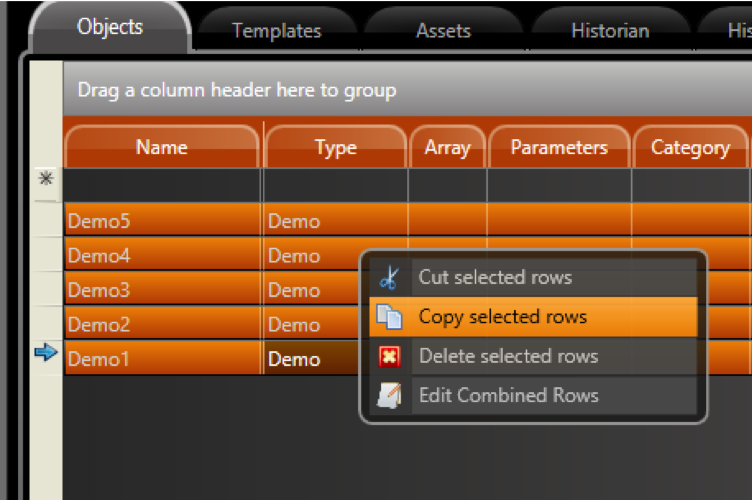
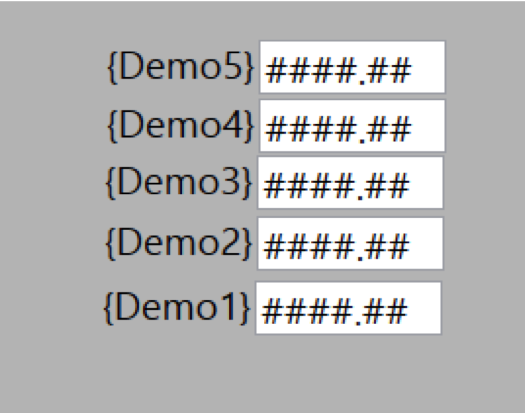
The tags of type Digital, Integer, Double, Decimal, Text, DateTime and TimeSpan have a default visualization that is the name of tag and an input/output text box. If you select multiple lines at Edit>Tags>Objects (click in one line, shift click in another line to mark a range), right-click to copy those lines to the clipboard, and paste into the displays, the system will automatically create one object to each of those tags.
If you want to change the properties of the objects created, for instance change the TextIO dynamic from "TwoWay" to "OutputOnly", select all the TextBox objects (clicking with the mouse on the display, and keeping it pressed, select the area with the objects), and double-click at any selected object to open the "Edit Combined Dynamics" dialog.
Hint
You can also copy the lines from Edit > Tags > Objects to Excel, add the columns Left and Top into the Excel table, then copy and paste that table, including the header column, back to the display; in this case the system will position the objects using the coordinates found in the table.
If you create a symbol with one dynamic parameter, and save it with the name "Integer", that will became the default visualization for the "Integer" tags. The same applies to any tag type.
Mapping a Symbol to a Tag Template
You can also define a symbol to be the default view for a tag template.
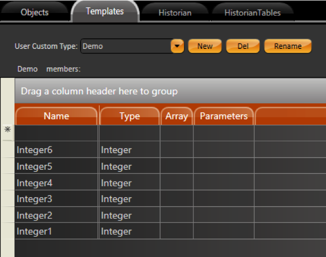
Go to Edit > Tags > Objects and create Tags with Type: Demo.
When inserting tags of that template type, the system will look for a Symbol with the same name of Template. If a match is found, that symbol is created and linked to the Tag you were inserting at the display.
If you create symbols using only Tag Elements, not expressions, you don't need to explicitly use the full syntax: #Label:(tag.Demo).Integer1 to define the label parameters. If you just use your tag at in the object dynamic properties and execute the Make Symbol command, the system will automatically search for tags in the symbol and create the related parameters. When using expressions, or when having multiple tags and templates in the same symbol, it is necessary to explicitly use the hash tag # and the parentheses in order to define the scope of your symbol's customizable parameters.
Linking Tags and Symbols using Categories
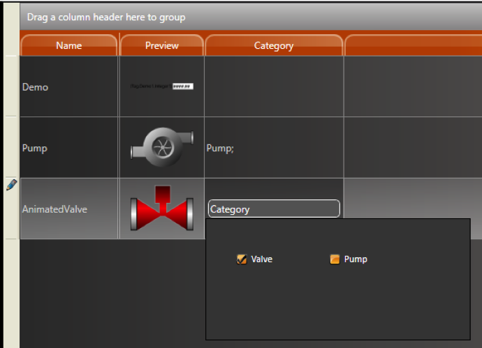
If you want to map a Symbol with a group of Tags, but you don't want to make this symbol map all Tags with the same Type. you can use the Category column to link which symbols should be used as the default interface to each group of tags.
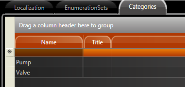
If the Category column is not visible, right-click in any Column name and select the check columns you want to see.
Go to Edit > Tags and define the category for the tags.
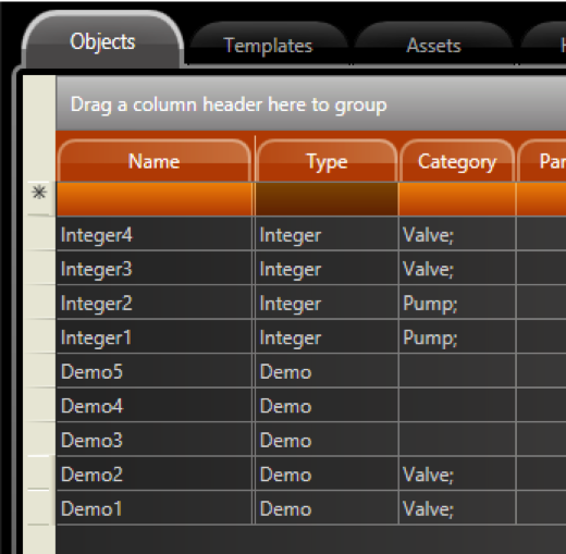
Select all Tags, copy then paste then into the Draw Environment. Each Tag will map to the respective symbol, according to the association defined in the Category column.
Use the CodeBehind tab to define a set of functions connected with a display. You can write code in either standard VB.Net or CSharp. You can also switch between the two. If you change your language selection, the system automatically converts existing code to the selected language.
If you need references to your own assemblies, use Run > Build > References.
CodeBehind functions can be executed when opening or closing, or while the display is open, depending on how you configure the code. You can use CodeBehind to define mouse and input command handling methods to be executed on a specific display.
For Dialog displays, use the built-in DialogOnOK method, which is called when the built-in OK button on the dialog is pressed. If "True" is returned on that method, the dialog is closed; if "False" is returned, the dialog remains open. This method is commonly used to ensure data validation on the dialog (which prompts the user to correct incorrect entries before closing the dialog).
The Code Behind of the Displays has the following pre-defined methods:
You can add your own .NET variables and methods to this page.
Because the client displays are designed to run on distributed and web environments, we recommend avoiding the use of functions that do not allow partial trust execution or that refer to physical file paths.
The desktop client settings control how the application displays on client computers. You configure Windows clients separately from iOS clients.
To configure the desktop client settings:
Column | Description |
Maximize When Open | Select to maximize the client window to fit the monitor. |
Stretch | Select how the layout stretches when clients use the application:
|
Scrollbar | Select to have a scrollbar display in the client window. |
Title | Enter a title for the client window. |
MinimizeBox | Select to display the standard minimize button. |
MaximizeBox | Select to display the standard maximize button. |
CloseBox | Select to display the standard close button. |
ResizeBox | Select to display the standard resize handle. |
Menus | Select which menus to display:
|
Always shows titles and menus in Test Mode | Select to always show the Minimize, Maximize, Close and Resize buttons when running a project in Test Mode. |
OnScreen KeyBoard | Select to display a virtual keyboard |
When Mouse Is Over Command Areas | Select behavior when mouse is over:
|
Mouse Cursor Visible | Select for the mouse pointer to be visible. |
Verify Tag Quality on Client Displays |
|
Disable Web Commands | Select to prohibit application users from sending commands to the PLC. |
Multiple windows on same computer share user logon | Users can run multiple instances of the application on the same computer. The user may need to log in as a different user from time to time. Select this option to automatically change the logged in user in all running instances of the application on the same computer. |
Column | Description |
Disable Commands | Select to prohibit application users from sending commands to the PLC. |
iPad Initial Page | Select the display that iPad users see when they start the application. |
iPhone Initial Page | Select the display that iPhone users see when they start the application. |
Stretch Fill | Select to resize the application to fill the device screen. |
iPad Landscape | Select if the alignment is landscape |
iPhone Landscape | Select if the alignment is landscape |
Column | Description |
Disable Commands | Select to prohibit application users from sending commands to the PLC. |
Desktop Initial Page | Select the display that Desktops users see when they start the application. |
Mobile Initial Page | Select the display that Mobile users see when they start the application. |
The namespace Display lists all displays with their properties and open and close methods.
The namespace Layout lists all layouts with their properties and open and close methods.
The namespace Client has the properties of the environment on each connected client computer or mobile device.
See http://www.tatsoft.com/help/fs-2014/runtime/index.html for the complete programming reference on runtime objects.