Page Tree
Previous Releases
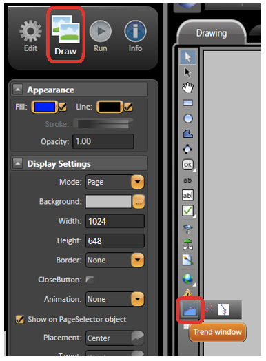
The Trend Window object is included in the version 2014.2 or newer. You can find the Trend Window object in the Draw section in the Drawing toolbar. See the image below for the exact location.
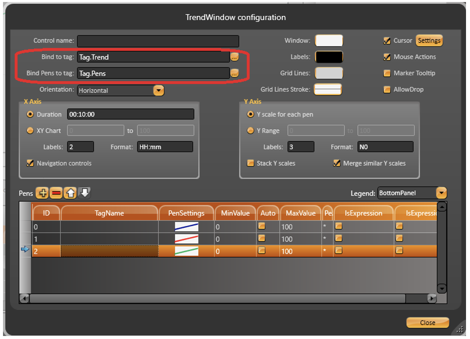
Select the Trend object, and draw in the display. Double-click the objetct to open the TrendWindow configuration dialog. The trend is able to work with only the Trend Window configuration dialog. However, if you need some advanced requirement, you can create two templates, TrendChart and TrendPen, with some trend properties. See the supported properties named below. Then, bind the main tags of those templates to the Trend Window object. When you change the members, the trend properties changes in Runtime.
Name | Type | Description |
AllowRuntimeSettings | Digital | Enable to change the trend settings in Runtime. E.g.: AllowRuntimeSettings = true |
BackZoom | Digital | Enable the back zoom. E.g.: BackZoom = false |
CanBackZoom | Digital | Check if there is back zoom in the current trend view. E.g.: CanBackZoom = false |
CanNextZoom | Digital | Check if there is next zoom in the current trend view. E.g.: CanNextZoom = false |
ChartArea | Rectangle* | Get the trend chart area. E.g.: ChartArea = Rectangle *Create a rectangle template with top, bottom, left, right, width, and height. |
CursorBrush | Text | Color of the primary cursor. E.g.: CursorBrush = “#FF0000FF” |
CursorOutput | DateTime | Current X axis value for the primary cursor. E.g.: CursorOutput = “15/01/2019 11:30:00.000” |
CursorOutputTooltip | Digital | Enable the primary cursor output tooltip. E.g.: CursorOutputTooltip = true |
CursorPosition | Double | Position of the primary cursor related to the trend object area (percentage 0-100). E.g.: CursorPosition = 100 |
Duration | Text | Duration time of the X axis. E.g.: Duration = "1m" |
EnableMouseActions | Digital | Enable the mouse actions in the trend object.
E.g.: EnableMouseActions = true |
EnableMouseCursorConnection | Digital | Connect the mouse with the primary cursor. E.g.: EnableMouseCursorConnection = false |
EnableYLabelsStackPensMode | Digital | Enables YLabels subdivisions view. E.g.: EnableYLabelsStackPensMode = 1 |
EnablePrimaryCursorAfterMouseClick | Digital | Enable to show the primary cursor after clicking the mouse. E.g.: EnablePrimaryCursorAfterMouseClick = false |
EnableSecondaryCursorAfterMouseClick | Digital | Enable to show the secondary cursor after clicking the mouse. E.g.: EnableSecondaryCursorAfterMouseClick = false |
EnableYScaleForEachPen | Digital | Enable individual pen scale for the Y axis. E.g.: EnableYScaleForEachPen = true |
ExpandedMargin | Text | Margin for the trend object when expanded. E.g.: ExpandedMargin = "0,100,0,200" |
GridLinesBrush | Text | Color of the grid line. E.g.: GridLinesBrush = “#FF0000FF” |
HighlightPens | Digital | Enable to highlight the pens when the mouse is over the pen label in the legend. E.g.: HighlightPens = true |
IntervalBetweenCursors | TimeSpan | Interval value between the primary and secondary cursors. E.g.: IntervalBetweenCursors = “00:10:00” |
IsExpanded | Digital | Check if the current trend is expanded. E.g.: IsExpanded = false |
LabelsBrush | Text | Color of the labels. E.g.: LabelsBrush = “#FFFF00FF” |
| LimitBrush | Text | This property fill the limit with the color choosed in Hexadecimal format. To make it works you have to set the "LimitMaxValue" and/or "LimitMinValue". E.g.: LimitBrush = “#FFFF00FF”; |
LimitFillOpacity | Double | This property defines the limit opacity. The number go from 0.0 to 1.0. By default it is 0. To make it works you have to set the "LimitMaxValue" and/or "LimitMinValue". E.g.: LimitFillOpacity = 0.5 |
LimitMaxValue | Double | This property will make appear a maximum horizontal line. To make it works you have to choose the color using the property "LimitBrush". E.g.: LimitMaxValue = 85 |
LimitMinValue | Double | This property will make appear a minimum horizontal line. To make it works you have to choose the color using the property "LimitBrush". E.g.: LimitMinValue = 22 |
MarkerTooltip | Digital | Show the tooltip when the mouse is over the markers. E.g.: MarkerTooltip = false |
MergeSameYScales | Digital | Merger the same scaling values of the Y axis. E.g.: MergeSameYScales = true |
NavigationControls | Digital | Show the navigation controls in the bottom of the trend object. E.g.: NavigationControls = false |
NextZoom | Digital | Enable the next zoom. E.g.: NextZoom = false |
OnlyZoomXAxis | Digital | Enable zoom only in the X axis. E.g.: OnlyZoomXAxis = false |
Orientation | Integer | Orientation of the trend drawing. 0 - Horizontal 1- Vertical, Top to Bottom 2- Vertical, Bottom To Top E.g.: Orientation = 0 |
Paused | Digital | Pause the plotting of the trend object. E.g.: Paused = false |
SecondaryCursorBrush | Text | Color of the secondary cursor. E.g.: SecondaryCursorBrush = “#FFFF00FF” |
SecondaryCursorOutput | DateTime | Current X axis value for the secondary cursor. E.g.: SecondaryCursorOutput = “15/01/2019 11:30:00.000” |
SecondaryCursorOutputTooltip | Digital | Enable the secondary cursor output tooltip. E.g.: SecondaryCursorOutputTooltip = false |
SecondaryCursorPosition | Double | Position of the secondary cursor related to the trend object area (percentage 0-100). E.g.: SecondaryCursorPosition = 0 |
SecondaryVerticalCursor | Digital | Enable the secondary vertical cursor. E.g.: SecondaryVerticalCursor = false |
ShowAlarms | Digital | Enable to show the alarm values in the trend chart area. E.g.: ShowAlarms = true |
ShowDuration | Integer | Enable to show the duration value in the vertical cursors. E.g.: ShowDuration = 0 |
ShowNoteDetails | Digital | Enable to show the note details in the trend chart area. E.g.: ShowNoteDetails = false |
ShowPrimaryCursorCloseButton | Digital | Show the close button in the primary cursor. E.g.: ShowPrimaryCursorCloseButton = false |
ShowPrimaryCursorValues | Digital | Show the pens value in the primary cursor. E.g.: ShowPrimaryCursorValues = false |
ShowRangeEvents | Digital | Enable to show the range events in the trend chart area. E.g.: ShowRangeEvents = true |
ShowRefreshButton | Digital | Enable to show the refresh button over the trend object.
E.g.: ShowRefreshButton = false |
ShowSecondaryCursorCloseButton | Digital | Show the close button in the secondary cursor. E.g.: ShowSecondaryCursorCloseButton = false |
ShowSecondaryCursorValues | Digital | Show the pens value in the secondary cursor. E.g.: ShowSecondaryCursorValues = false |
ShowTagNotes | Digital | Enable to show the tag notes in the trend chart area. E.g.: ShowTagNotes = true |
ShowTimeNotes | Digital | Enable to show the time notes in the trend chart area. E.g.: ShowTimeNotes = true |
ShowXValueNotes | Digital | Enable to show X axis values in the trend chart area. E.g.: ShowXValueNotes = true |
StackPens | Digital | Enable the stack pens for Y axis. E.g.: StackPens = false |
StartDateTime | DateTime | Start date time of X axis. E.g.: StartDateTime = “15/01/2019 9:00:0.000” |
TimeBeforeNow | TimeSpan | Time value before the current time. E.g.: TimeBeforeNow = “02:00:00” |
VerticalCursor | Digital | Enable to show the primary vertical cursor. E.g.: VerticalCursor = true |
WindowBrush | Text | Color of the trend background window. E.g.: WindowBrush = “#FFFF00FF” |
XEndValue | DateTime | End value for the X axis. E.g.: XEndValue = “15/01/2019 11:00:0.000” |
XGridLines | Text | Number of the grid lines for the X axis. E.g.: XGridLines = "4" |
XLabelDegrees | Double | Skew degree of the labels in the X axis. E.g.: XLabelDegrees = 0 |
XLabelFormat | Text | Format of the labels in the X axis. E.g.: XLabelFormat = "dd/MM/yy HH:mm:ss" |
Xlabels | Text | Number of the labels in the X axis. E.g.: XLabels = "2" |
XLabelsEditable | Digital | Enable the X labels for editing. E.g.: XLabelsEditable = false |
XPadding | Double | Space from the trend bottom to starting the chart area. E.g.: XPadding = 0 |
XStartValue | DateTime | Start value for the X axis. E.g.: “15/01/2019 9:00:0.000” |
YGridLines | Text | Number of the grid lines for the Y axis. E.g.: YGridLines = "5" |
YLabelFormat | Text | Format of the labels in the Y axis. E.g.: YLabelFormat = “N1” |
YLabels | Text | Number of the labels in the Y axis. E.g.: YLabels = "3" |
YLabelsEditable | Digital | Enable the Y labels for editing. E.g.: YLabelsEditable = true |
YMaxValue | Double | Maximum value for the Y axis. E.g.: YMaxValue = 100 |
YMinValue | Double | Minimum value for the Y axis. E.g.: YMinValue = 0 |
YPadding | Double | Starting position of the chart area from the trend left side. E.g.: YPadding = 0 |
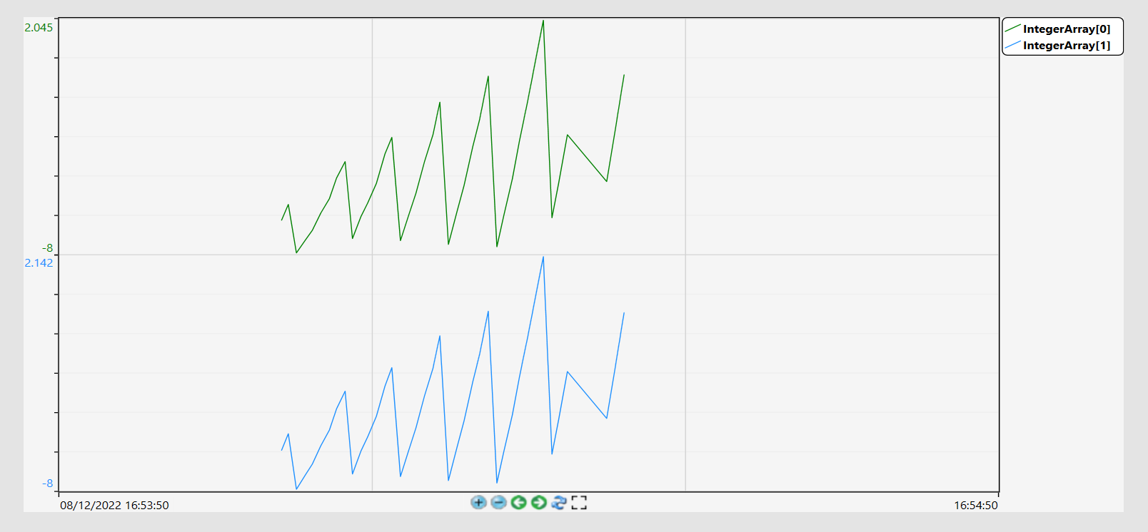
When more than one tag is being measured and the StackPens property is set to "true", the chart will turn into a stack chart-like visualization by dividing it in as many portions as measured tags. See image below for an example. Mouse over the image to see the property used.
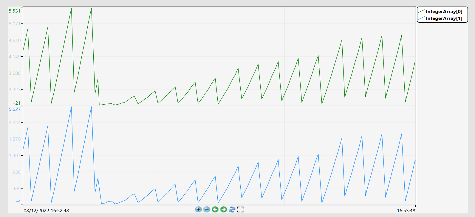
Also, you can set the EnableYLabelsStackPensMode property to show YLabels subdivisions. See an example below. Mouse over the image to see the property used.
Name | Type | Description |
Auto | Digital | Auto scaling for the Min. and Max. of the Y axis. E.g.: Auto = false |
CursorValue | Double | Pen value at the intersection with the primary cursor. E.g.: CursorValue = 42.10 |
FilterLevel | Integer | Set the filter level. E.g.: FilterLevel = 40 |
HorizontalOffset | TimeSpan | Offset time at the X axis. E.g.: HorizontalOffset = “05:00:00” |
MaxValue | Double | Maximum value for the Y axis. E.g.: MaxValue = 100 |
MinValue | Double | Minimum value for the Y axis. E.g.: MinValue = 0 |
PenColor | Text* | Color of the pen. E.g.: PenColor = “#FFFF0000” *In the datagrid you can use the Cell Editor as Color type. |
PenLabel | Text | Label of the pen. (ReadWrite)
E.g.: PenLabel = “Tag1” PenLabel = “*” “*” get the Description or Comment or TagName |
PenLabelOutput | Text | Label to show in the legend object. (Only Read)
E.g.: PenLabelOutput = “Tag1” |
PenSettings | Text | Settings of the pen as LineColor, LineStroke, FillArea, Marker.* E.g.: Stroke=#FF0070C0;Fill=#FF0070C0; Marker=5;StrokeDashCap=Round; StrokeEndLineCap=Flat;StrokeThickness=3 *When used in the datagrid object, it uses unique UI. |
PenUnits | Text | Show the Tag Unit. E.g.: PenUnits = “ft” |
PenValue | Double | Current value for the pen tag. E.g.: PenValue = 55.3 |
PIAF | Text | Show the OSISoft PI points related with the pen. E.g.: PIAF.Tag.Tag1 |
SecondaryCursorValue | Double | Pen value at the intersection with secondary cursor. E.g.: CursorValue = 42.10 |
ShowHighlighted | Digital | Enable to show the pen as highlighted E.g.: ShowHighlighted = true |
SPCEnabled | Digital | Show the SPC lines values in the trend chart. The SPC needs to be configured in the SPC Settings. E.g.: SPCEnabled = true |
SPCMaxValue | Double | Show the SPC Maximum value when enabled in the SPC Settings. E.g.: SPCMaxValue = 100.00 |
SPCMeanValue | Double | Show the SPC Mean value when enabled in the SPC Settings. E.g.: SPCMeanValue = 43.45 |
SPCMedianValue | Double | Show the SPC Median value when enabled in the SPC Settings. E.g.: SPCMedianValue = 43 |
SPCMinValue | Double | Show the SPC Minimum value when enabled in the SPC Settings. E.g.: SPCMinValue = 0 |
SPCSettings | Text | Configure the SPC with the options Minimum , Maximum, Mean, Median, Sum, DeviationPlus, and DeviationLess.* E.g.: PCMinVisible=true; SPCMinLine.Stroke=#FFFFDEAD; SPCSigmaPlusVisible=true; SPCSigmaPlusLine.Stroke=#FFFFDEAD; *When used in the datagrid object, it uses unique UI. |
SPCSigmaMinusValue | Double | Show the SPC Sigma Minus value when enabled in the SPC Settings. E.g.: SPCSigmaMinusValue = -10.90 |
SPCSigmaPlusValue | Double | Show the SPC Sigma Plus value when enabled in the SPC Settings. E.g.: SPCSigmaPlusValue = 97.82 |
SPCSumValue | Double | Show the SPC Sum value when enabled in the SPC Settings. E.g.: SPCSumValue = 50133 |
TagName | Text | Tag name related with the pen. E.g.: TagName = “Tag1” |
Visible | Digital | Enable the pen visibility. E.g.: Visible = true |