Page Tree
Previous Releases
The Themes function allows you to customize the appearance of your display to better suit your Project. It is available for .Net and HTML5 Clients.
On Run-Dictionaries-Themes, you will find predefined theme palettes that are built into the project templates, except for the Blank Project.
You can also create your own theme by selecting colors for each column.
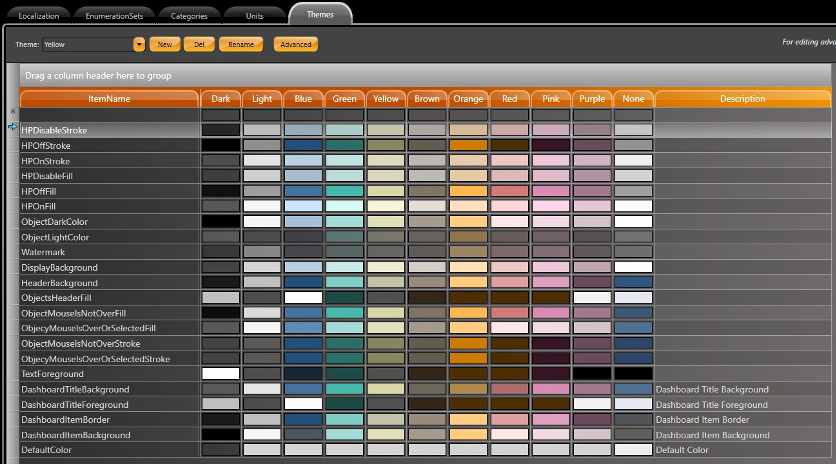
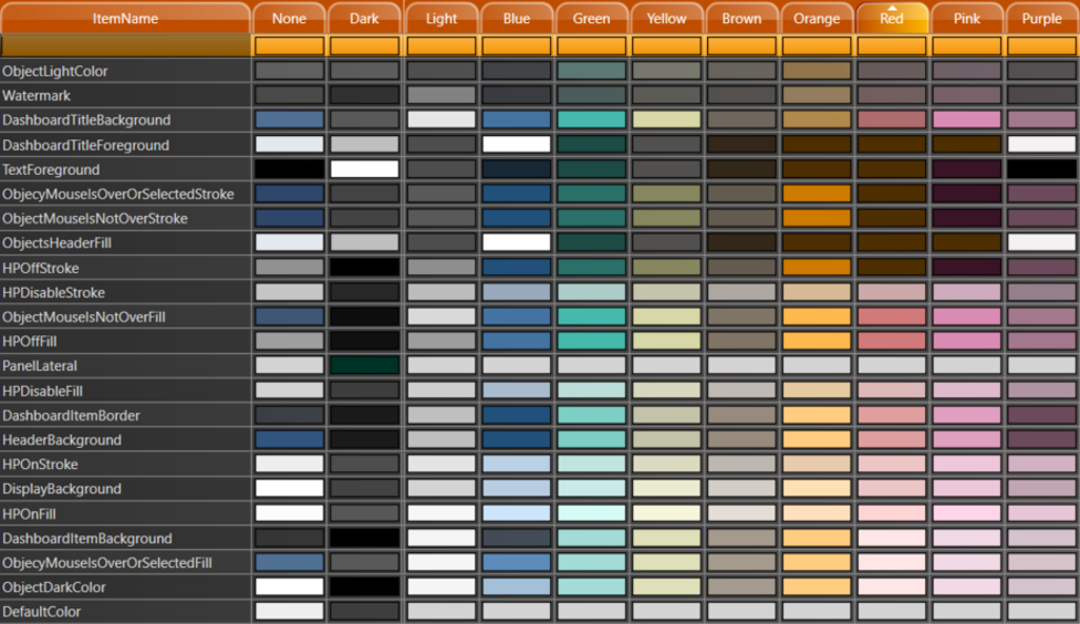
The colors and themes displayed in the image below are built into new projects. The DashBoard, HighPerformance and Standard display elements are grouped together in the ItemName column.
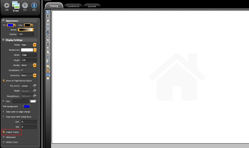
To Enable or Disable the themes function, navigate to the Draw Editor and click on the checkbox located at bottom of the panel on the left.
When a theme is disabled for an entire page, the theme for every object in the display will also be disabled. The color will be the built in colors shown in the image above.
When you change the theme in runtime, the pages and objects will keep their default configured colors.
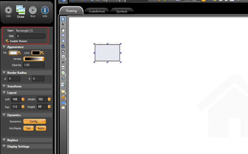
Individual components will have an Enable/Disable checkbox in the left panel settings.
There are a couple different ways in which a theme can be applied to an object or project.
Configure a Palette for an Element in a Page (Rectangle, Button, Textblock, etc)
Pre-defined Theme and Colors
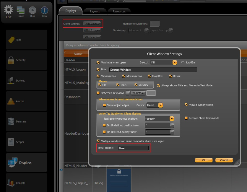
In Edit-Displays-Displays and under the .Net Client Settings, you will find an Initial Theme textbox. In this field, you can enter the name to whatever theme you want to be active for the project startup.
Theme selection in runtime can be done using the syntax below in Script codes, Expression fields, or objects configuration.
To set the project to the default configuration, without a custom theme, you need to set the Client.Theme to an empty string (Client.Theme= ””) or create an empty theme table and assign it to the theme property.
@Client.Theme = "Blue";
@Client.Theme = "Dark";
@Client.Theme = "Yellow";
@Client.Theme = "";
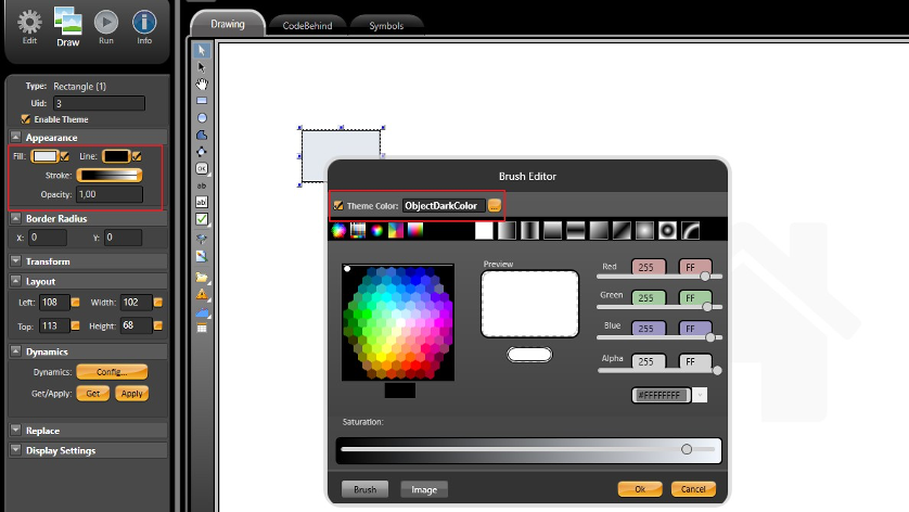
To set a theme for an element in the display, you need to open the Appearance configuration window located in the left panel toolbar, in Run-Dictionaries-Themes.
At the top of the Appearance configuration window, you will find a field called Theme Color. To select the color you want, you can insert the item name or click on the button and browse through the available ones.
For the most part, this theme color configuration window will be available for all elements that can have their colors changed.
When a new project is created, it already contains several built in themes and colors. You can create a new theme with new colors, or you can change the color of the pre-configured theme.
Some important elements that have pre-defined colors:
You can use all the colors in the image below to create whatever color palette you desire.
In Run-Dictionaries-Themes and under the Advanced settings, you can customize the component properties.
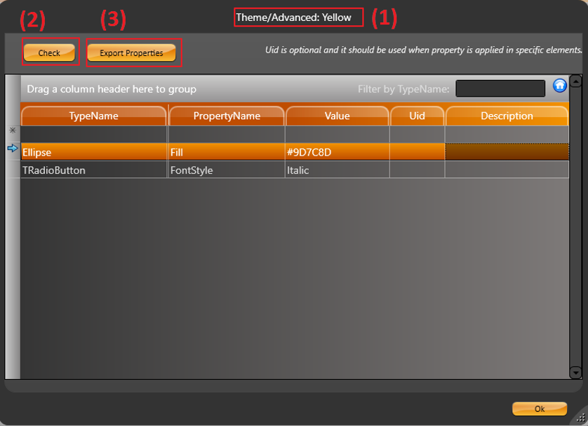
When clicking on the advanced button from the theme tab, the advanced dialog box will open based on which theme you selected with the combobox.
It is important to notice that these properties will only be valid for the specific theme displayed in the Configuration Window (1).
By opening the advanced settings, you can easily access components such as text font, radio box marker, combo box marker, or components that are not colors or are not exposed in the drawing tool configuration.
In the example above, the customization is valid to TRadioButtons and all Ellipse (we can overwrite the basic color configuration in the Advanced settings). To filter for specific elements, you should use the Uid property to select a specific element.
To make sure the configuration you inserted is valid, always click on the Check button (2). A popup message will appear with a Success/Error message.
The Export Properties button (3) will export all properties that are available, for the selected object, to the clipboard. The user can see the properties by pasting them to a text editor application (e.g.: Notepad). Below you can find some of the exported properties for the Ellipse object.
* Type: System.Windows.Shapes.Ellipse
- Properties:
. Effect, System.Windows.Media.Effects.Effect
. Fill, System.Windows.Media.Brush
. Focusable, System.Boolean
. Height, System.Double
. UseLayoutRounding, System.Boolean
. VerticalAlignment, System.Windows.VerticalAlignment
. Visibility, System.Windows.Visibility
. Width, System.Double